Beyond the shutter: How to edit landscape photos for a natural, professional look
Landscape photography captures the grandeur of nature, but the real artistry often begins during post-processing. Many photographers inadvertently sabotage their work by over-editing, leading to neon foliage, unnatural contrast, and “crusty” skies that immediately signal a lack of technical refinement.
The goal of professional landscape editing is to enhance the scene’s inherent beauty while keeping it believable. Whether you are using Adobe Lightroom, Photoshop, or Capture One, this guide provides a logical workflow to achieve crisp, realistic results.
Why edited landscape photos often look fake
We have all been there: you slide the ‘Clarity’ bar up, the photo looks punchy for a second, and then you realize you’ve turned a beautiful mountain range into something that looks like it belongs in an early 2000s video game.
- Global saturation: Boosting saturation across the entire image often results in distorted, “plastic” colors.
- Over-applied texture and clarity: Heavy use of these sliders creates unnatural halos along high-contrast edges.
- Mismatched tones: Editing the sky in total isolation without considering the light on the foreground leads to jarring inconsistencies.
- Flattened dynamic range: Overusing HDR merging or aggressive shadow recovery can strip an image of its natural depth and volume.
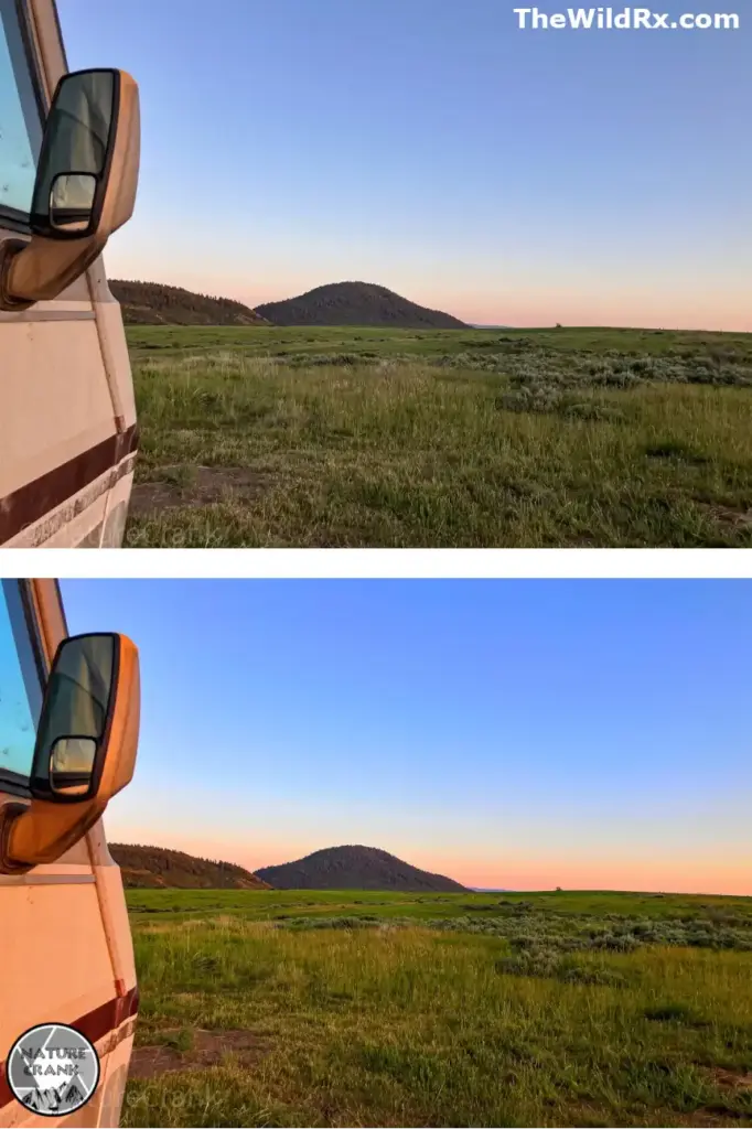
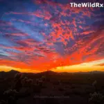
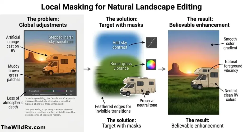
The case study: The global vs. local adjustment challenge
This image comparison highlights the exact problem with using global saturation and contrast sliders. In the bottom image, a heavy global adjustment was applied to ‘pop’ the grass and sky. The result is a total technical failure. The light tan RV side mirror and body have picked up an unnatural orange cast, making it look like it was painted.
The vibrant greens in the grass are muddied, over-emphasizing brown patches and losing subtle detail. Worst of all, the beautiful sunset sky transition has been broken; instead of a smooth, believable gradient from blue to orange, we see harsh, ‘stepped’ colors and poor blending. This is the definition of a ‘fried’ edit.
How local masks would have saved it
The professional solution: Local masks. To save this image, I should have strictly avoided the global sliders. Instead, a specific Linear Gradient Mask should have been applied only to the sky. By isolating the sky, the editor could have increased the contrast or lowered the exposure without spilling an artificial orange glow onto the RV.
Then, a second mask could have been applied to the grass, perhaps slightly increasing the saturation only of the greens while keeping the muted browns grounded in reality. The RV and mirror should have been masked out of any global color shifts entirely, preserving their neutral colors. A local, feathered mask on the sky gradient would have also ensured that the blue-to-orange transition remained perfectly smooth, maintaining the natural integrity of the sunset.
The “perfect shot” starts in the field
Capture the light: In-camera settings that save your edit
While modern software is powerful, it cannot manufacture data that wasn’t captured. To avoid a ‘crusty’ or noisy edit, focus on your in-camera settings and physical tools before you press the shutter. If you aren’t sure which tools are necessary for your kit, check out our guide, “Essential camera gear for landscape photography: What’s actually worth buying?“, to see which investments truly impact your final image.
- Expose for the highlights: Digital sensors are notoriously bad at recovering “blown-out” whites. If your sky is a solid white block on your screen, that data is gone forever. Use your camera’s Histogram or “Zebra” stripes to ensure your brightest highlights aren’t clipping. It is much easier to recover shadows than it is to fix a white, featureless sky. To master these conditions before you even open your editing software, see our guide, “How to shoot during the golden hour: A photographer’s guide to perfect light“, to ensure you are capturing the most dynamic data possible.
- Keep your ISO low: For landscapes, use a tripod and stick to your camera’s base ISO (usually 64 or 100). High ISO introduces “digital noise,” which becomes amplified and ugly once you start pushing the Shadow and Contrast sliders in post-processing. To keep your ISO at 100, a rock-solid tripod is non-negotiable. The Peak Design Travel Tripod is a go-to for its portability and strength.
- Use a CPL (Circular Polarizer): Some things cannot be faked in Lightroom. A CPL removes physical glare from water and wet leaves, increasing natural saturation and contrast that looks much more realistic than any slider can achieve.
- Consider focus stacking: If you have a subject very close to the lens and mountains in the distance, take multiple frames at different focus points. You can blend these later for “front-to-back” sharpness that a single aperture cannot achieve.
Start with a strong RAW foundation
Your edit is only as good as your source file. To ensure maximum flexibility during post-processing:
- Shoot in RAW: RAW files retain the essential highlight and shadow data required for non-destructive editing. This provides the flexibility needed to adjust white balance and recover highlights or shadows during post-processing. To see how to handle these files after your shoot, check out our guide on how to edit landscape photos for a natural, professional look.
- Select a neutral profile: Avoid “Vivid” or “Landscape” in-camera profiles. Use a standard or neutral profile like Adobe Color or Adobe Neutral to ensure your histogram is accurate.
- Apply lens corrections: Always enable lens profile corrections to remove unintentional vignetting and distortion.
- Set your white balance: Do this first. Adjusting the temperature and tint sets the foundation for all subsequent color work. While you can adjust exposure at this point, exposure is best adjusted before the photo as it’s much harder to edit an over-exposed shot in processing. Many photographers leave it on AWB because it doesn’t matter for RAW, but setting it manually in the field helps with pre-visualizing the final mood.
Logical workflow for natural landscape editing
Adhering to a consistent, logical sequence prevents you from ‘chasing’ your edits and over-processing the file:
| Step | Action | Focus |
| Global Tones | Exposure, Contrast, Highlights, Shadows | Recover detail without “flattening” |
| Color Balance | Vibrance & HSL sliders | Enhance mid-tones, protect strong colors |
| Tone Curve | Gentle S-curve | Add depth and natural contrast |
| Local Edits | Masks, Gradients, Dodge & Burn | Targeted enhancements only |
| Final Polish | Sharpening & Noise Reduction | Apply to details only, never globally |
This is where you move from basic corrections to creative intent. To follow this workflow, I recommend the Adobe Creative Cloud Photography Plan, which includes both Lightroom and Photoshop at the best value.
How to use vibrance vs. saturation
For a natural look, vibrance is your primary tool. It selectively boosts muted colors while protecting already saturated tones. Use the HSL (Hue, Saturation, Luminance) panel for specific, subtle tweaks—such as slightly increasing the saturation of the oranges in a sunset—rather than using a global slider that affects the entire frame.
Pro tip: Check the Calibration panel (in Lightroom). Increasing the saturation of the “Blue Primary” slider can often create a more organic, deep color pop than the standard Vibrance slider.
The art of monochrome: Why black and white editing is a test of tonality
In landscape photography, removing color strips away the distraction of “neon” greens or “electric” blues, forcing the viewer to focus entirely on shape, texture, and light. A professional black and white edit is not as simple as hitting a “grayscale” button; it requires a deep understanding of tonal separation.
- Color-to-Black and White conversion: Use the B&W mix panel to control how specific colors translate into gray. For example, darkening the “Blue” slider can turn a flat sky into a dramatic, high-contrast backdrop without introducing digital artifacts.
- Emphasizing texture: Because you aren’t worried about skin tones or realistic foliage colors, you can push Texture and Local Contrast slightly further in monochrome to emphasize rugged mountain peaks or flowing water—but the rule of “no halos” still applies.
- The silver lining: Black and white is the best way to save a “flat” day. If the golden hour never arrived and the colors are muddy, a high-contrast B&W edit can transform a boring RAW file into a dramatic, fine-art masterpiece.
To learn more about the emotional side of shooting without color, check out our guide, “Setting the mood: Black and white photography tips for beginners“, to master the art of seeing in monochrome.
Mastering local adjustments
Use masking tools to guide the viewer’s eye. “Dodging” (brightening) and “burning” (darkening) allow you to emphasize the natural flow of light. A graduated filter can subtly brighten a dark foreground, while a radial mask can “pop” a distant peak. Always use heavy feathering on your masks to ensure transitions are invisible.
To add a professional “atmosphere,” try a subtle Orton effect. By slightly lowering the Clarity and increasing Dehaze on a local mask in the highlights, you can create a soft, ethereal glow that feels like natural mist or morning light.
Common landscape editing mistakes to avoid
- Ignoring the histogram: Watch for “clipping.” If your highlights or shadows touch the edges of the histogram, you are losing data.
- Over-sharpening smooth surfaces: Apply sharpening only to high-detail areas (rocks/trees) while masking it away from water or sky.
- Forcing “drama”: Do not try to manufacture a sunset where the light was flat. In these situations, your best bet is to lean into the existing atmosphere, such as fog or soft forest light. For more on handling these specific environments, see our guide, “How to photograph mountains and forests: Essential landscape photography tips“, to capture better RAW files in any weather.
- Missing sensor spots: Always zoom in to 100% and scan the sky for dust spots. A clean sky is the hallmark of a professional edit.
- Killing atmospheric perspective: Distant elements should remain softer and lighter than the foreground to maintain a realistic sense of depth.
Frequently asked questions about landscape editing
Final thoughts: Master the art of subtle editing
Refining a RAW file into a professional landscape is a lesson in restraint. However, even the best edit cannot save a poor frame. To ensure your source files are as strong as your post-processing, see our guide on Mastering landscape photography composition: Essential techniques for stunning images to build a solid foundation before you ever sit down at the computer.
Join the conversation
How do you keep your own landscape edits looking natural? Do you have a “go-to” setting you always check before finalizing a photo, or perhaps a struggle you still encounter in the editing suite? Share your thoughts, tips, or experiences in the comments below.
Discover more from The Wild Rx aka NatureCrank™
Subscribe to get the latest posts sent to your email.